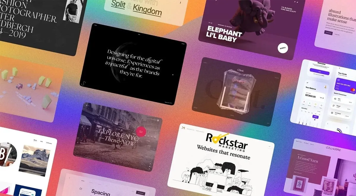
The digital landscape is a constantly evolving canvas, and web design is at the forefront of this artistic evolution. Gone are the days of static, text-heavy websites. Today’s web design trends are all about creating immersive, interactive experiences that engage users on a deeper level. This article delves into the latest design movements, exploring how elements like micro-animations, bold typography, and dynamic user interfaces are captivating audiences and shaping the future of the web.
Responsive Design
Responsive design is a crucial aspect of modern web development, ensuring that websites are accessible and functional across various devices and screen sizes. With the proliferation of smartphones, tablets, and other mobile devices, it’s imperative for websites to adapt dynamically to different resolutions and orientations. This adaptability not only provides a seamless user experience but also improves search engine rankings, as Google prioritizes mobile-friendly websites in its search results.
In addition to catering to diverse devices, responsive design also considers factors such as touch screen navigation, bandwidth limitations, and user interaction patterns. By employing fluid grids, flexible images, and CSS media queries, developers can create layouts that adjust proportionally to fit different screen dimensions. This approach eliminates the need for separate mobile versions of websites, streamlining the development process and ensuring consistency across platforms.
Dark Mode
| Pros | Cons | Considerations |
| Reduces eye strain | May affect readability for some users | Provide an option for users to switch between dark and light modes |
| Enhances visual appeal | Not suitable for all types of content | Test dark mode compatibility with different devices and browsers |
| Saves battery life on OLED screens | Requires additional design considerations | Ensure sufficient color contrast for accessibility purposes |
Dark mode, also known as night mode or dark theme, has emerged as a popular trend in web design. It offers a dark color scheme for user interfaces, making them easier on the eyes, especially in low-light environments. Here are some key aspects of dark mode and its impact on web design:
- Reduced Eye Strain: One of the primary benefits of dark mode is its ability to reduce eye strain, particularly in dimly lit environments. By using darker colors for text and backgrounds, it minimizes the amount of light emitted by screens, which can be more comfortable for prolonged use.
- Enhanced Visual Appeal: Dark mode often lends a sleek and modern look to websites and applications. The contrast between light text and dark backgrounds can create a visually striking aesthetic that appeals to users who prefer a more sophisticated design.
- Battery Life Savings: For devices with OLED screens, dark mode can help conserve battery life. Since OLED displays only illuminate the pixels needed to display content, using dark colors requires less power than bright ones, resulting in improved battery efficiency.
Overall, dark mode has become a prominent feature in web design, offering both aesthetic appeal and functional benefits. By implementing dark mode effectively and considering user preferences and accessibility requirements, designers can create visually stunning and user-friendly interfaces that cater to a diverse audience.
Minimalism
Minimalism in web design focuses on simplicity, clarity, and the removal of unnecessary elements to create clean and visually appealing interfaces. This approach prioritizes essential content and functionality while eliminating distractions that could detract from the user experience. Here are some key principles and techniques associated with minimalistic web design:
- Simplified Layouts: Minimalist websites often feature clean and uncluttered layouts with ample white space. By reducing visual noise and complexity, minimalist designs guide users’ attention to the most critical elements on the page.
- Limited Color Palette: Minimalist designs typically employ a restrained color palette, with neutral tones and subtle accents. By using fewer colors, designers create a sense of harmony and cohesion while maintaining a clean aesthetic.
- Typography Emphasis: Typography plays a crucial role in minimalist design, with clean and legible fonts used to convey information effectively. Minimalist websites often feature generous amounts of white space around text elements, enhancing readability and visual appeal.
- Focus on Content: In minimalist design, content is king. By prioritizing content over flashy graphics or excessive ornamentation, minimalist websites deliver information in a straightforward and digestible manner.
By embracing minimalism in web design, developers can create elegant and user-friendly interfaces that prioritize clarity, functionality, and user experience. Minimalist websites offer streamlined experiences that resonate with users seeking simplicity and efficiency in their online interactions.
Typography Trends
Typography trends play a significant role in shaping the visual identity of modern websites. Here are three key subcategories within typography trends:
Expressive Fonts
Designers are increasingly using bold and expressive fonts to make a statement and capture users’ attention. These fonts range from playful and whimsical to bold and dramatic, adding personality and flair to website designs.
Creative Typography Layouts
Instead of traditional text placement, designers are experimenting with creative typography layouts to create unique and engaging experiences. This includes overlapping text, unconventional alignments, and dynamic arrangements that break away from traditional grid structures.
Dynamic Text Animations
Interactive and dynamic text animations are gaining popularity as a way to enhance user engagement and visual interest. From subtle hover effects to more elaborate animations triggered by user interactions, dynamic text elements add a layer of interactivity and sophistication to web typography.
3D Elements
Incorporating 3D elements into web design adds depth and realism to digital experiences. Here are some key aspects of integrating 3D elements into web design:
- Immersive Visuals: 3D elements create immersive visual experiences that captivate users and bring digital content to life. Whether it’s a rotating product model or a dynamic background, 3D elements add depth and dimension to websites, enhancing their overall aesthetic appeal.
- Interactive Engagement: Interactive 3D elements allow users to interact with content in a more engaging and meaningful way. From interactive product tours to playable games, 3D elements enable dynamic user experiences that encourage exploration and interaction.
- Enhanced Storytelling: 3D elements offer new opportunities for storytelling and narrative-driven experiences. By incorporating animated characters, environments, and objects, designers can create compelling narratives that resonate with users on a deeper level.
- Visual Hierarchy: When used strategically, 3D elements can help establish visual hierarchy and guide users’ attention to key areas of the website. By adding depth and perspective, designers can emphasize important content and direct users’ focus where it matters most.
Overall, 3D elements offer exciting possibilities for web design, enabling designers to create immersive, interactive, and visually stunning experiences that engage users and elevate digital storytelling.

